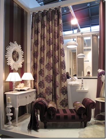
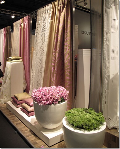
There were literally tens thousands of vendors showing products at the three major trade shows I attended in Europe; Heimtextile, IMM Cologne and Maison et Objet. I expected to see a huge diversity in color and range among the manufacturers represented but this was not the case at all. Overwhelmingly purple was the dominant color at all three shows. In fact for many vendors it was the only color excluding neutrals.
Purple was present in all of its various hues and values including deep dark purples, brownish purples, mauves, and surprisingly; fuchsias. Yes, you don’t have to check your eyesight – I did say MAUVE! That old standby of the 1980’s. The favorite color of your Grandmother and Aunt Edith. It’s here and it’s out there in all of it’s dusty glory.
The Missoni booths were entirely purple with deep bluish purple carpets and walls. There was a ton of purple carpet all over the shows as well as walls painted and wallpapered in every possible shade.
Bright Purples mixed with toned down or grayed out versions were a common theme.
Dark charcoal purples serves as a backdrop for deep burgundy.
Some vendors used wispy, browned mauves and dusty pinks as accents.
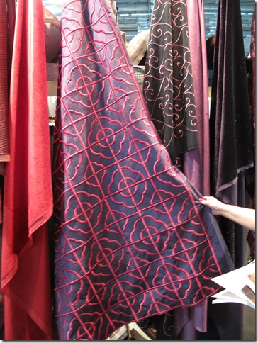
Others were very bright, mixing deep purple and vibrant fuchsia with rich burgundy reds.
This Aussie vendor mixed them all together in a fabulous suzani.
Pale hues were abundant but did still had more heft than the usual lavenders. They were a bit greyer or browner, definitely not pastel.
Bold patterns and textures were created using the various hues with lots of high contrast heavy embroidery and embellishment.
Even traditional prints and embroidered silks were predominantly purple.
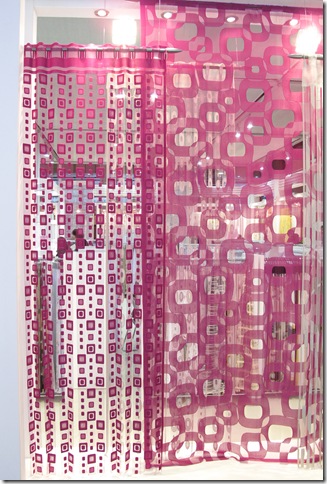
Sheers were available at Heimtextile in every imaginable construction and a gain in our color of the moment.
Loved this combination!
Fantastic embroidered ikat at Dadar in various shades of purple.
Very pale and very brown versions were abundant especially in linens. Loved the subtlety of the color on the natural fiber – it was gorgeous.
Bold high contrast prints brought out the vibrancy of these colors.
In many cases paired with neutrals the colors almost became neutral themselves.
Purple has traditionally been a tough sell in the US. We had a few discussions with vendors and other designers about why this is the case. Some of us thought that I could originate with our forefathers heritage and the breaking away from the crown in the American Revolution.
Purple has long been the color of royalty and ruling classes in Europe and as such was probably shunned during the formation of our new country. Perhaps that bias is still present today in some way.
Europe has definitely embraced this color wholeheartedly as its go to option for the coming year but it remains to be seen if the US will be as willing to adopt it in their own interiors. We are seeing it featured prominently in shelter mags and by vendors but I am not sure if consumers will really take to it easily.
What do you think? Is the US ready for purple, mauve and fuchsia? Can we overcome the stigma of those 80’s mauve and grey and teal color ways? Are you personally planning on injecting some purple into your life? Comment and let me know………


No comments:
Post a Comment