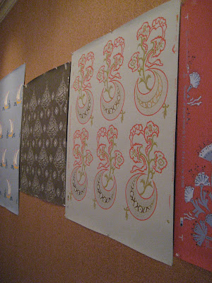
Patience can be a virtue in the design world. Clients need patience to wait for furniture that takes months to complete and sometimes designers need patience to see the fruition of all their hard work. Such is the case with the new wallpaper line from
Katie Ridder. She started the project two years ago as a summer project with her children and now her new baby, the wallpaper line is available through
Holland & Sherry.

I'm lucky to know Laurie Reynolds who works for Katie and I was very excited when she mentioned the new line a few months ago. She helped to work on the project along with Robin Goldman to whom Katie would bring back her ideas every September. The line consists of 7 patterns and an array of colorways that resulted in 40 different wallpapers.

Laurie was sweet enough to facilitate a phone interview between me and Katie and she couldn't have been nicer. I was wondering why she started with wallpaper and not fabric and I think she was much too modest when she answered that with so many different fabrics available on the market she didn't think she couldn't compete. But her love of stencils led her to wallpaper when developing a line of stencils proved too difficult.

Katie and I can both remember our mothers tackling do it yourself wallpaper projects growing up but for a while wallpaper fell out of favor so it's nice to see that it is definitely making a comeback. It may not be as easy as painting as Katie pointed out but it really does make a great impact.

Since I am in the midst of going out on my own, I was anxious to hear how Katie started her own firm. She doesn't have a design degree either but she did say that she got the best training possible when she worked for House & Garden and House Beautiful. It took a lot of work and skill to take an empty house and create a story for a magazine. She then opened a store on the Upper East Side which led to customers asking her to help them out with their homes. And the rest as they say, is history!

When I was looking through Katie's portfolio online, I noticed some new projects and some of the best designs I've seen in a while in the design world. I love her use of color and that her style is not cookie cutter. It really looks like she tailors the decor to the client and the space which lots of interesting details and patterns. I've posted many of my favorites here and I hope you enjoy them as much I did. I also want to thank Katie for taking time out of her busy day to inspire me! Hopefully with a little patience, I will have a portfolio like hers someday!
 Patience can be a virtue in the design world. Clients need patience to wait for furniture that takes months to complete and sometimes designers need patience to see the fruition of all their hard work. Such is the case with the new wallpaper line from Katie Ridder. She started the project two years ago as a summer project with her children and now her new baby, the wallpaper line is available through Holland & Sherry.
  I'm lucky to know Laurie Reynolds who works for Katie and I was very excited when she mentioned the new line a few months ago. She helped to work on the project along with Robin Goldman to whom Katie would bring back her ideas every September. The line consists of 7 patterns and an array of colorways that resulted in 40 different wallpapers.
 Laurie was sweet enough to facilitate a phone interview between me and Katie and she couldn't have been nicer. I was wondering why she started with wallpaper and not fabric and I think she was much too modest when she answered that with so many different fabrics available on the market she didn't think she couldn't compete. But her love of stencils led her to wallpaper when developing a line of stencils proved too difficult.
 Katie and I can both remember our mothers tackling do it yourself wallpaper projects growing up but for a while wallpaper fell out of favor so it's nice to see that it is definitely making a comeback. It may not be as easy as painting as Katie pointed out but it really does make a great impact.
  Since I am in the midst of going out on my own, I was anxious to hear how Katie started her own firm. She doesn't have a design degree either but she did say that she got the best training possible when she worked for House & Garden and House Beautiful. It took a lot of work and skill to take an empty house and create a story for a magazine. She then opened a store on the Upper East Side which led to customers asking her to help them out with their homes. And the rest as they say, is history!
  When I was looking through Katie's portfolio online, I noticed some new projects and some of the best designs I've seen in a while in the design world. I love her use of color and that her style is not cookie cutter. It really looks like she tailors the decor to the client and the space which lots of interesting details and patterns. I've posted many of my favorites here and I hope you enjoy them as much I did. I also want to thank Katie for taking time out of her busy day to inspire me! Hopefully with a little patience, I will have a portfolio like hers someday!


No comments:
Post a Comment