This is my second post dedicated to new blogs that I found last year and have grown to enjoy more and more every time I read them. My first post introduced you to designer Tobi Fairley's new blog.
Today, meet Michelle Morelan, the very talented artist and designer of A Schematic Life. She is an interior designer based in Vancouver, BC - what is up with these crafty Canadians? They seem to be hogging a lot of the talent out there along with the Aussies!
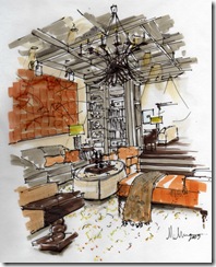
She has actually been blogging for a while but she blew me away with this rendering that she sent to Decorno in response to a readers design dilemma. I am absolutely in love with her rendering style - it evokes so much emotion and energy.
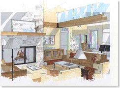
She works magic with drafting velum, pens, and markers which she uses to give just enough imagery to the space without making it look sterile and two dimensional. She obviously paid close attention in drafting class and must have had some fabulous teachers.
Even her quick renderings have a great flair to them which is hard to achieve on the spot. Good rendering is just as much about what you don't include as what you do and Michelle is very adept at using negative space.
Like many creative talents she sometimes makes remarks about her work in posts indicating that she is not satisfied with her level of competence but I have found that those artists who continually challenge themselves to become better are ussually doing it right in the first place. So many very talented people are truly unaware how remarkable their work is to others. They can't see past the imperfections that they would like to correct. I think her work is fantastic.
Here she is hanging out with some other talented blogging friends from North of the Border; Maria Killiam from Color Me Happy, Nancy Devries of Urban Aesthetics and my online buddy Patricia Gray. How awesome to be able to get a group of gals like this together - I'm so jealous.
Hand rendering is a dying art in our industry and it is a subject that I am very passionate about. Whenever I speak or lecture at trade shows, schools or design centers I try to encourage designers and students to develop their hand sketching skills alongside their CAD and graphic software skills. Both are necessary in our industry but many schools have lost site of teaching these critical fundamentals. It's like teaching math majors only to use a calculator and never showing them how to find the answer to their calculations with their minds.
When you see well done renderings you immediately understand the power that they can convey to the client.
In a recent post Michelle walks her readers through her rendering process, step by step, showing them how she completed the rendering above which features a Nierman Weeks chandelier.
Even her more formal renderings show her personality.
Michelle is also very adept at sketching as she shows by posting excerpts from her sketchbooks filled with images from her travels to Amsterdam.
She posts about other topics on design as well including sharing great sources, products, and personal stories but I am partial to her original renderings because they are so unique to her.

Thank you Michelle for sharing your images and for the inspiration that they have given to those who see them.
I can't wait to see what you draw next.....


No comments:
Post a Comment