I showed you the primary colors shown at market in my post about Purples and Mauves but there were also some emerging color stars that will take on more importance in the next couple of seasons. A glossy almost lacquered Black is the anchoring neutral for this collection of ultra bight heavily saturated accent colors.
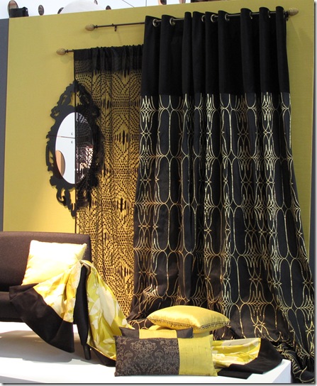
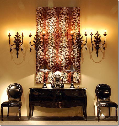
One of the less vibrant color combinations in this palette is black set off with metallic silver or gold and accented with the same chartreuse green that we saw commonly mixed with purple and mauve.
Designers Guild
By grounding this intense color with the use of an abundant amount of black the finished effect is sophisticated an surprisingly soothing. Playing with texture, sheen, create motion and balance in the room.
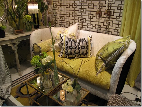
Gaudarte
We saw the same chartreuse accented with white and the effect was an intensely vibrant and bright space.
Gaudarte
This color combination was not for the faint of heart but would provide for a happy and vital space.
Gaudarte
I saw quite a few bold combinations of pattern and color used on modern furnishings much like the traditional combination upholstered pieces we saw a few years ago. This new trend combined traditional fabric motifs in super bright color ways all arranged in asymmetrical pieces that showed off a high level of contrast.
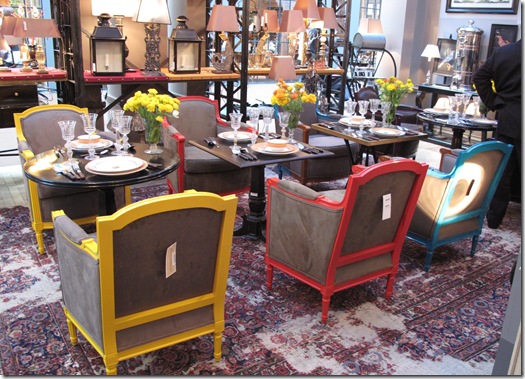
Furniture frames lacquered in super bright colors were neutralized with men's wear inspired woolen upholstery in various shades of grey and taupe. These pieces were set off with patent leather welting in various colors including black.
Another view of the back of the chairs. I saw many grouping of similar or very diverse chairs in assorted super bright grouped with small tables and set in a traditional dining room setting. Also worthy of notice is the rug used in this display. Seems there is a growing trend to repurpose old or surplus rugs by bleaching them. Bleach is applied randomly as on this rug or more uniformly on others to create a very worn look.
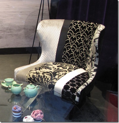
Another example of mix & match traditional patterns on a modern chair. This black and white beauty does a great job of combining fabrics with heavy texture, shine, and bold pattern.
This years Pantone color of the year Turquoise, was present in this super bright color mix. Here a lovely turquoise sofa by Shine Home was a big hit at Maison et Objet.
Shine Home
Reflective surfaces are a key component of this look so we saw many fabulous products printed on or painted behind glass. I absolutely love this look!
Provence et Fils
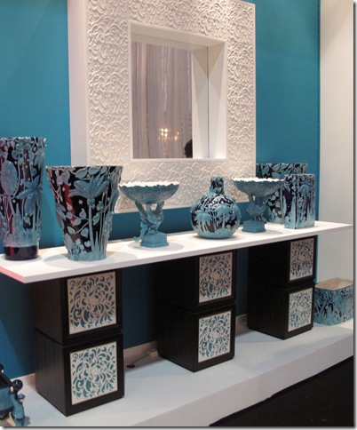
More turquoise mixed with high gloss black and white in high relief. Definitely Chinoiserie inspired I loved this vignette.
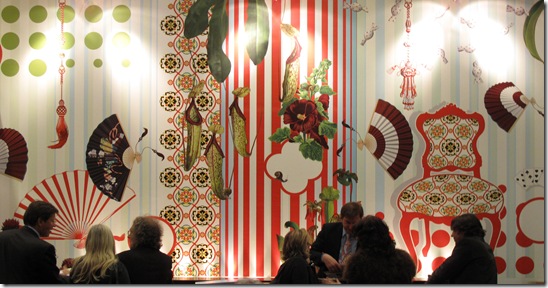
To go along with super bright furnishings we found super bright and super large graphic wall paper from Marburg.
Marburg
Another set of mismatched bright chairs in various finishes and styles.
The last color in this scheme is bright orange and I am talking serious Halloween or for you fashionistas out there, Hermes orange.

Tempered again with glossy black it is a strong statement to be sure. But one that I found surprisingly appealing.
This room really shows how intense the sheen is on the black furnishings and accessories.
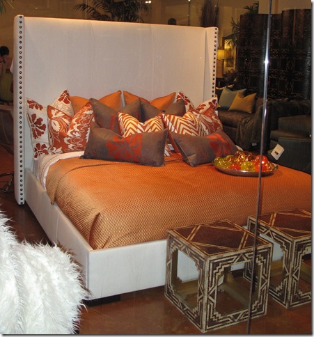
Orange was also paired with white for high contrast.
It seems that this emerging trend towards bright color and high contrast is the direct opposite of the dominant trend of faded grays, neutrals and natural products mixed with soft hues of purple and mauve and the highly textured woods like oak and teak use for case goods. Only time will tell what the “new” look will be but I’ll keep my eye on this palette. I think it has legs.
What do you think about it? Fan of faded, soothing, ethereal interiors or longing for some uber bright pigments to brighten your day.
Please leave a comment and let me know.






No comments:
Post a Comment